User Guide · Documents Module
The GeoCore Manual
A walk-through of the GeoCore Documents (DMS) module: setting up projects and metadata schemas, then using the day-to-day features like notifications, alerts, and virtual folders to keep your project documents organized and on schedule.
Adding a New Project
To begin, go to geocore.pages.dev.
Overview of the Login Screen
When you first arrive, you’ll land on the login screen. Use the login option at the top of the page to sign in.

Create a New Project
Go to the Project section and click the “New Project” button. A popup appears where you enter a Project Name. Once the project is created, select it to open the project view. As shown below, every new project follows the same layout.

Setting Up the Document Module
When you first open the document management module, there are no items to explore yet, so we’ll start with the settings. Under Settings you’ll find four options:
- Metadata SchemaSet or edit the metadata schema used for document management.
- Location MetadataSet or edit the metadata that appears in the Mapping Module.
- Virtual FoldersSet or edit the virtual folder hierarchy.
- Clone from ProjectCopy the metadata schema and location metadata from a previously configured project.
Cloning means you only have to create a schema once, then reuse it across many projects.

Updating / Setting Up the Metadata Schema
Selecting “Metadata Schema” from Settings opens a form builder with several options, including:
- Form BuilderVisually format the upload form, which appears each time a new document is added to the system.
- PreviewShows a preview of the current form design.
- CopyCopy the metadata schema for use in other projects.
- PastePaste a metadata schema copied from a previous project.
- Schema SettingsName the current schema and choose whether the form appears.
- Add FieldAdd a new field to the metadata schema to track any type of data.
- Save SchemaThere is no automatic save, so save your progress manually.
- Delete SchemaDelete or reset the metadata schema.

Adding New Fields to the Metadata Schema
Click the Add Field button to open the “Add Field” dialog box. The dialog offers several field types for recording data in any format you need, from standard text and dates to dropdowns and checkboxes. Two special field types, Contact and Multi-Contact, let you link to the project’s Address Book.
Text-Type Fields
After selecting a Text type, you can complete the field as shown:
- LabelThe name of the field.
- DescriptionOptional. Helps users when completing the form.
- PlaceholderOptional. Sets a default value.
- Required FieldSets the current field as required.
- Min / MaxSets the allowed length of the response.
- VisibilitySets when the field appears. By default, all fields are visible for data entry.
- CancelCloses the dialog box without saving.
- Save FieldSaves the field.
Text, Number, Date, and Time fields share similar properties, except that Min / Max is not available for Date and Time fields.

Dropdown & Multi-Select Fields
After selecting a Dropdown (or Multi-Select) type, you can complete the field as shown:
- LabelThe name of the field.
- DescriptionOptional. Helps users when completing the form.
- PlaceholderOptional. Sets a default value.
- Required FieldSets the current field as required.
- OptionsLists all the options for the dropdown, one option per line.
- VisibilitySets when the field appears. By default, all fields are visible for data entry.
- CancelCloses the dialog box without saving.
- Save FieldSaves the field.

Checkbox Fields
After selecting a Checkbox type, you can complete the field as shown:
- LabelThe name of the field.
- DescriptionOptional. Helps users when completing the form.
- PlaceholderOptional. Sets a default value.
- Required FieldSets the current field as required.
- VisibilitySets when the field appears. By default, all fields are visible for data entry.
- CancelCloses the dialog box without saving.
- Save FieldSaves the field.

Special Fields
The File Upload option lets users attach additional files to a document being uploaded as metadata. The attached file carries no metadata of its own; it serves purely as a reference file.
After selecting File Upload, you can complete the field as shown:
- LabelThe name of the field.
- DescriptionOptional. Helps users when completing the form.
- PlaceholderOptional. Sets a default value.
- Required FieldSets the current field as required.
- Accepted File TypesSets which file types are allowed.
- Max File Size (MB) & Max FilesLimits the size and number of files users can upload.
- VisibilitySets when the field appears. By default, all fields are visible for data entry.
- CancelCloses the dialog box without saving.
- Save FieldSaves the field.

Contact & Multi-Contact Fields
Contact and Multi-Contact let users select one contact or multiple contacts, respectively, from the project’s Address Book.
After selecting Contact, you can complete the field as shown:
- LabelThe name of the field.
- DescriptionOptional. Helps users when completing the form.
- PlaceholderOptional. Sets a default value.
- Required FieldSets the current field as required.
- VisibilitySets when the field appears. By default, all fields are visible for data entry.
- CancelCloses the dialog box without saving.
- Save FieldSaves the field.

Using the Form Builder within the Metadata Schema
You can update the form’s style at any time to make data entry easier. By default, all fields are listed in a single column in the order they were created. To change this, click the Form Builder.

When you open the Document Metadata Form Builder, you’ll see the following options:
- Design ElementsDivider and Section elements that can be dragged and dropped into the builder to organize fields with proper sections and breaks.
- Data FieldsShows all fields available to be assigned. Any field dragged into the builder disappears from this list.
- Form Builder (canvas)Drop and arrange fields in the central canvas, where they appear in the style applied here.
- PreviewShows how the form will look to users when a new file is being uploaded.
- CopyCopy the design of the current form.
- PastePaste a copied style.
- SaveThe form builder does not save automatically, so save often.
- Field FormattingSelect any field in the canvas; the right-hand panel then lets you adjust how it appears and edit its data.

Try it: sample form schema
Copy the JSON below and paste it into the Form Builder’s import dialog to load a ready-made metadata form. Use it as a starting point for your own schemas.
{
  "fields": [
    {
      "id": "section_document_type",
      "type": "section",
      "label": "Document Type",
      "order": 0,
      "layout": { "columnSpan": 12 },
      "validation": {},
      "sectionConfig": {
        "heading": "Document Type Classification",
        "padding": "md",
        "borderColor": "#e5e7eb",
        "backgroundColor": "#f9fafb"
      }
    },
    {
      "id": "field_type",
      "type": "select",
      "label": "Type of Record",
      "order": 1,
      "layout": { "columnSpan": 6 },
      "options": [
        { "label": "Project Governance and Administration", "value": "Project Governance and Administration" },
        { "label": "Land Access and Right of Way", "value": "Land Access and Right of Way" },
        { "label": "Environmental and Regulatory", "value": "Environmental and Regulatory" },
        { "label": "Engineering and Design", "value": "Engineering and Design" },
        { "label": "Procurement and Contracts", "value": "Procurement and Contracts" },
        { "label": "Construction Field Execution", "value": "Construction Field Execution" },
        { "label": "Quality Assurance and Quality Control", "value": "Quality Assurance and Quality Control" },
        { "label": "Health and Safety", "value": "Health and Safety" },
        { "label": "Stakeholder and Indigenous Engagement", "value": "Stakeholder and Indigenous Engagement" },
        { "label": "Commissioning and Close Out", "value": "Commissioning and Close Out" }
      ],
      "validation": {},
      "parentSectionId": "section_document_type"
    },
    {
      "id": "field_subtype",
      "type": "select",
      "label": "Subtype",
      "order": 2,
      "layout": { "columnSpan": 6 },
      "cascade": {
        "optionMapping": {
          "Health and Safety": [
            { "label": "Safety Management", "value": "Safety Management" },
            { "label": "Incidents", "value": "Incidents" },
            { "label": "Training and Compliance", "value": "Training and Compliance" }
          ],
          "Engineering and Design": [
            { "label": "Route Selection", "value": "Route Selection" },
            { "label": "Detailed Engineering", "value": "Detailed Engineering" },
            { "label": "Design Reviews", "value": "Design Reviews" }
          ],
          "Procurement and Contracts": [
            { "label": "Contracting", "value": "Contracting" },
            { "label": "Procurement", "value": "Procurement" },
            { "label": "Materials Management", "value": "Materials Management" }
          ],
          "Commissioning and Close Out": [
            { "label": "Pre Commissioning", "value": "Pre Commissioning" },
            { "label": "Commissioning", "value": "Commissioning" },
            { "label": "Project Close Out", "value": "Project Close Out" }
          ],
          "Construction Field Execution": [
            { "label": "Pre Construction", "value": "Pre Construction" },
            { "label": "Clearing and Grading", "value": "Clearing and Grading" },
            { "label": "Installation", "value": "Installation" },
            { "label": "Crossings", "value": "Crossings" },
            { "label": "Backfill and Reclamation", "value": "Backfill and Reclamation" }
          ],
          "Environmental and Regulatory": [
            { "label": "Regulatory Approvals", "value": "Regulatory Approvals" },
            { "label": "Environmental Assessments", "value": "Environmental Assessments" },
            { "label": "Environmental Monitoring", "value": "Environmental Monitoring" },
            { "label": "Environmental Inspections", "value": "Environmental Inspections" }
          ],
          "Land Access and Right of Way": [
            { "label": "Land Agreements", "value": "Land Agreements" },
            { "label": "Landowner Engagement", "value": "Landowner Engagement" },
            { "label": "Access and ROW Documentation", "value": "Access and ROW Documentation" }
          ],
          "Project Governance and Administration": [
            { "label": "Project Setup", "value": "Project Setup" },
            { "label": "Correspondence", "value": "Correspondence" },
            { "label": "Meetings", "value": "Meetings" },
            { "label": "Change Management", "value": "Change Management" }
          ],
          "Quality Assurance and Quality Control": [
            { "label": "Inspection Records", "value": "Inspection Records" },
            { "label": "Testing", "value": "Testing" },
            { "label": "Non Conformance", "value": "Non Conformance" }
          ],
          "Stakeholder and Indigenous Engagement": [
            { "label": "Consultation", "value": "Consultation" },
            { "label": "Monitoring", "value": "Monitoring" }
          ]
        },
        "parentFieldId": "field_type"
      },
      "validation": {},
      "parentSectionId": "section_document_type"
    },
    {
      "id": "field_subsubtype",
      "type": "select",
      "label": "Sub Subtype",
      "order": 3,
      "layout": { "columnSpan": 6 },
      "cascade": {
        "optionMapping": {
          "Testing": [
            { "label": "Weld Inspection", "value": "Weld Inspection" },
            { "label": "Hydrostatic Testing", "value": "Hydrostatic Testing" },
            { "label": "Electrical Testing", "value": "Electrical Testing" }
          ],
          "Installation": [
            { "label": "Trenching and Foundations", "value": "Trenching and Foundations" },
            { "label": "Pipe Stringing or Pole Erection", "value": "Pipe Stringing or Pole Erection" },
            { "label": "Lowering In or Conductor Stringing", "value": "Lowering In or Conductor Stringing" }
          ],
          "Project Setup": [
            { "label": "Project Charter", "value": "Project Charter" },
            { "label": "Scope Definition", "value": "Scope Definition" },
            { "label": "Project Execution Plan", "value": "Project Execution Plan" }
          ],
          "Correspondence": [
            { "label": "Client Correspondence", "value": "Client Correspondence" },
            { "label": "Contractor Correspondence", "value": "Contractor Correspondence" },
            { "label": "Regulator Correspondence", "value": "Regulator Correspondence" }
          ],
          "Land Agreements": [
            { "label": "Easements", "value": "Easements" },
            { "label": "Temporary Workspace Agreements", "value": "Temporary Workspace Agreements" },
            { "label": "Access Agreements", "value": "Access Agreements" }
          ],
          "Environmental Monitoring": [
            { "label": "Wildlife Monitoring", "value": "Wildlife Monitoring" },
            { "label": "Watercourse Monitoring", "value": "Watercourse Monitoring" },
            { "label": "Wetland Monitoring", "value": "Wetland Monitoring" }
          ]
        },
        "parentFieldId": "field_subtype"
      },
      "validation": {},
      "parentSectionId": "section_document_type"
    },
    {
      "id": "field_record_detail",
      "type": "select",
      "label": "Record Detail",
      "order": 4,
      "layout": { "columnSpan": 12 },
      "cascade": {
        "optionMapping": {
          "Easements": [
            { "label": "Registered Agreements", "value": "Registered Agreements" },
            { "label": "Amendments", "value": "Amendments" }
          ],
          "Project Charter": [
            { "label": "Approved Charter", "value": "Approved Charter" },
            { "label": "Revisions and Amendments", "value": "Revisions and Amendments" }
          ],
          "Weld Inspection": [
            { "label": "NDT Reports", "value": "NDT Reports" },
            { "label": "Repair Logs", "value": "Repair Logs" }
          ],
          "Wildlife Monitoring": [
            { "label": "Species Observations", "value": "Species Observations" },
            { "label": "Nesting Surveys", "value": "Nesting Surveys" }
          ],
          "Client Correspondence": [
            { "label": "Emails", "value": "Emails" },
            { "label": "Formal Letters", "value": "Formal Letters" }
          ],
          "Trenching and Foundations": [
            { "label": "Excavation Logs", "value": "Excavation Logs" },
            { "label": "Foundation Inspections", "value": "Foundation Inspections" }
          ]
        },
        "parentFieldId": "field_subsubtype"
      },
      "validation": {},
      "parentSectionId": "section_document_type"
    },
    {
      "id": "section_general",
      "type": "section",
      "label": "General Information",
      "order": 5,
      "layout": { "columnSpan": 12 },
      "validation": {},
      "sectionConfig": {
        "heading": "General Information",
        "padding": "md",
        "borderColor": "#e5e7eb",
        "backgroundColor": "#f9fafb"
      }
    },
    {
      "id": "field_document_no",
      "type": "text",
      "label": "Document No",
      "order": 6,
      "layout": { "columnSpan": 4 },
      "validation": {},
      "parentSectionId": "section_general"
    },
    {
      "id": "field_document_name",
      "type": "text",
      "label": "Document Name",
      "order": 7,
      "layout": { "columnSpan": 12 },
      "validation": { "required": true },
      "parentSectionId": "section_general"
    },
    {
      "id": "field_document_status",
      "type": "select",
      "label": "Document Status",
      "order": 8,
      "layout": { "columnSpan": 4 },
      "options": [
        { "label": "Draft", "value": "Draft" },
        { "label": "Submitted", "value": "Submitted" },
        { "label": "Approved", "value": "Approved" },
        { "label": "Rejected", "value": "Rejected" },
        { "label": "Superseded", "value": "Superseded" },
        { "label": "Expired", "value": "Expired" }
      ],
      "validation": {},
      "parentSectionId": "section_general"
    },
    {
      "id": "field_confidentiality",
      "type": "select",
      "label": "Confidentiality",
      "order": 9,
      "layout": { "columnSpan": 4 },
      "options": [
        { "label": "Public", "value": "Public" },
        { "label": "Internal", "value": "Internal" },
        { "label": "Confidential", "value": "Confidential" },
        { "label": "Regulatory", "value": "Regulatory" }
      ],
      "validation": {},
      "parentSectionId": "section_general"
    },
    {
      "id": "field_revision_number",
      "type": "text",
      "label": "Revision Number",
      "order": 10,
      "layout": { "columnSpan": 4 },
      "validation": {},
      "parentSectionId": "section_general"
    },
    {
      "id": "divider_1",
      "type": "divider",
      "label": "Divider",
      "order": 11,
      "layout": { "columnSpan": 12 },
      "validation": {}
    },
    {
      "id": "section_dates",
      "type": "section",
      "label": "Key Dates",
      "order": 12,
      "layout": { "columnSpan": 12 },
      "validation": {},
      "sectionConfig": {
        "heading": "Key Dates",
        "padding": "md",
        "borderColor": "#e5e7eb",
        "backgroundColor": "#f9fafb"
      }
    },
    {
      "id": "field_date_added",
      "type": "date",
      "label": "Date Added",
      "order": 13,
      "layout": { "columnSpan": 3 },
      "validation": {},
      "parentSectionId": "section_dates"
    },
    {
      "id": "field_submission_date",
      "type": "date",
      "label": "Submission Date",
      "order": 14,
      "layout": { "columnSpan": 3 },
      "validation": {},
      "parentSectionId": "section_dates"
    },
    {
      "id": "field_revision_date",
      "type": "date",
      "label": "Revision Date",
      "order": 15,
      "layout": { "columnSpan": 3 },
      "validation": {},
      "parentSectionId": "section_dates"
    },
    {
      "id": "field_expiry_date",
      "type": "date",
      "label": "Expiry Date",
      "order": 16,
      "layout": { "columnSpan": 3 },
      "validation": {},
      "parentSectionId": "section_dates"
    },
    {
      "id": "field_renewal_date",
      "type": "date",
      "label": "Renewal Date",
      "order": 17,
      "layout": { "columnSpan": 3 },
      "validation": {},
      "parentSectionId": "section_dates"
    },
    {
      "id": "field_followup_date",
      "type": "date",
      "label": "Follow Up Date",
      "order": 18,
      "layout": { "columnSpan": 3 },
      "validation": {},
      "parentSectionId": "section_dates"
    },
    {
      "id": "divider_2",
      "type": "divider",
      "label": "Divider",
      "order": 19,
      "layout": { "columnSpan": 12 },
      "validation": {}
    },
    {
      "id": "section_ownership",
      "type": "section",
      "label": "Ownership and Notes",
      "order": 20,
      "layout": { "columnSpan": 12 },
      "validation": {},
      "sectionConfig": {
        "heading": "Ownership and Notes",
        "padding": "md",
        "borderColor": "#e5e7eb",
        "backgroundColor": "#f9fafb"
      }
    },
    {
      "id": "field_author",
      "type": "text",
      "label": "Author or Originator",
      "order": 21,
      "layout": { "columnSpan": 4 },
      "validation": {},
      "parentSectionId": "section_ownership"
    },
    {
      "id": "field_owner",
      "type": "text",
      "label": "Document Owner",
      "order": 22,
      "layout": { "columnSpan": 4 },
      "validation": {},
      "parentSectionId": "section_ownership"
    },
    {
      "id": "field_notes",
      "type": "textarea",
      "label": "Notes",
      "order": 23,
      "layout": { "columnSpan": 12 },
      "validation": {},
      "parentSectionId": "section_ownership"
    }
  ]
}Setting Up Cascading Dropdowns
Cascading dropdowns let one Select field control the options available in another, for example, choosing Type of Record filters the list shown in Subtype, which in turn filters Sub Subtype. This section walks through the setup end-to-end.
Step 1: Create the parent field
- Add a field and choose Select as the type.
- Enter the options using
value:Labelformat, one per line. - Save the field.
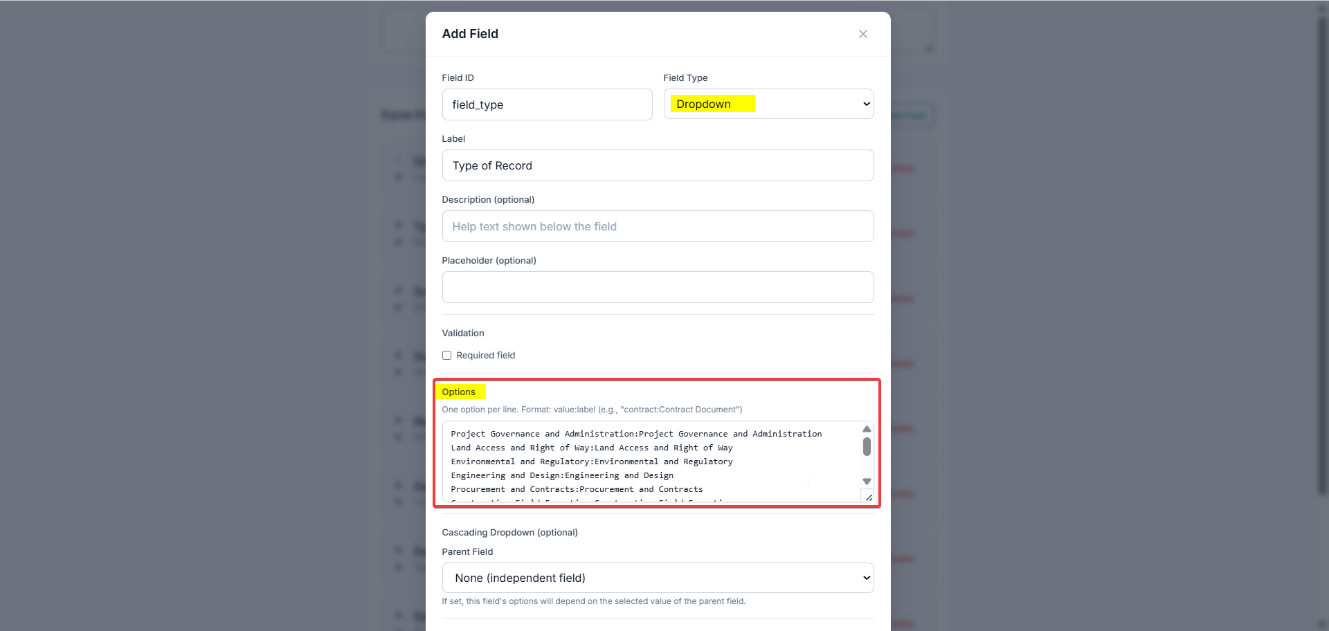
value:Label format.Step 2: Add the child field
- Add another Select field.
- Leave the Options list empty; the child's options are supplied by the parent.
Step 3: Link the parent and child
- Open the child field and enable Cascading Dropdown.
- Pick the parent field from the list.
- For each parent option, enter the child options in
value:Labelformat. - Leave the mapping blank for any parent option that should show no children.
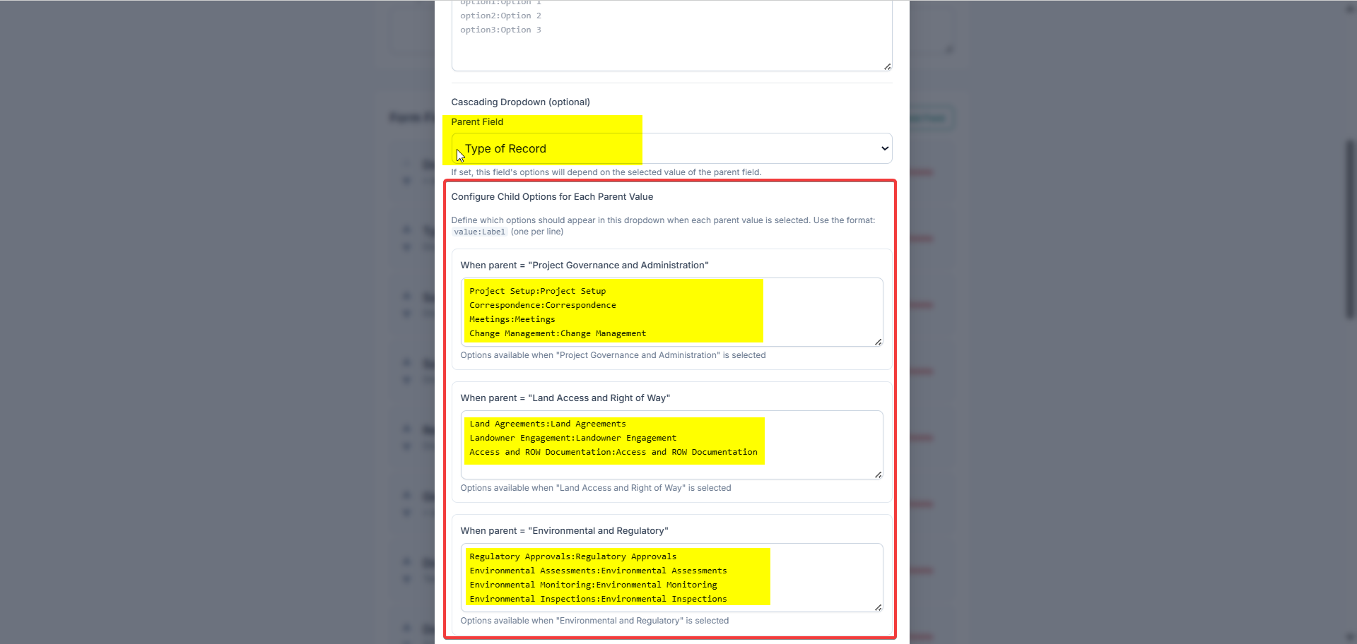
Step 4: Add deeper levels (optional)
Repeat steps 2–3 with the child field as the new parent to build multi-level hierarchies such as Type → Subtype → Sub Subtype → Record Detail. There is no fixed depth limit; each new level cascades from the one above it.
The system validates each cascade on save. It will warn if the chosen parent field does not exist or is not a Select type, so cascades cannot be linked to text, date, or numeric fields.
Notifications & Alerts
Audience: all project members. Applies to the GeoCore Web Documents (DMS) module.
Overview: how the pieces fit together
In GeoCore, Notifications and Alerts are two halves of one feature:
- An Alert is a reminder attached to a specific document, for example “Permit expires”, “Renew insurance”, or “Submit inspection report”. Each alert has a date, an importance level, an optional reminder lead time, and can be assigned to teammates.
- Notifications are how GeoCore tells people about those alerts: by email (sent automatically) and through the in-app Notifications page, where every alert in the project is listed.
So an Alert is the record you create on a document; Notifications are the emails and dashboard that surface it to the right people at the right time. You reach the dashboard from the Documents page using the Notifications (bell) button.
How you get notified
GeoCore sends document-alert notifications automatically by email. There are four kinds:
| Notification | When it is sent | Who receives it |
|---|---|---|
| Reminder | Ahead of the due date, based on the alert’s Reminder lead time (only if a reminder was set) | Assigned users + the alert creator |
| Due | When the alert’s date/time arrives. The alert’s status changes from Pending to Triggered | Assigned users + the alert creator |
| Escalation | When a due (“Triggered”) alert has not been acknowledged or dismissed within ~24 hours | Assigned users + creator + project admins |
| Daily digest | Once every morning, summarizing each person’s open alerts (overdue ones flagged) | Each assigned user with open alerts |
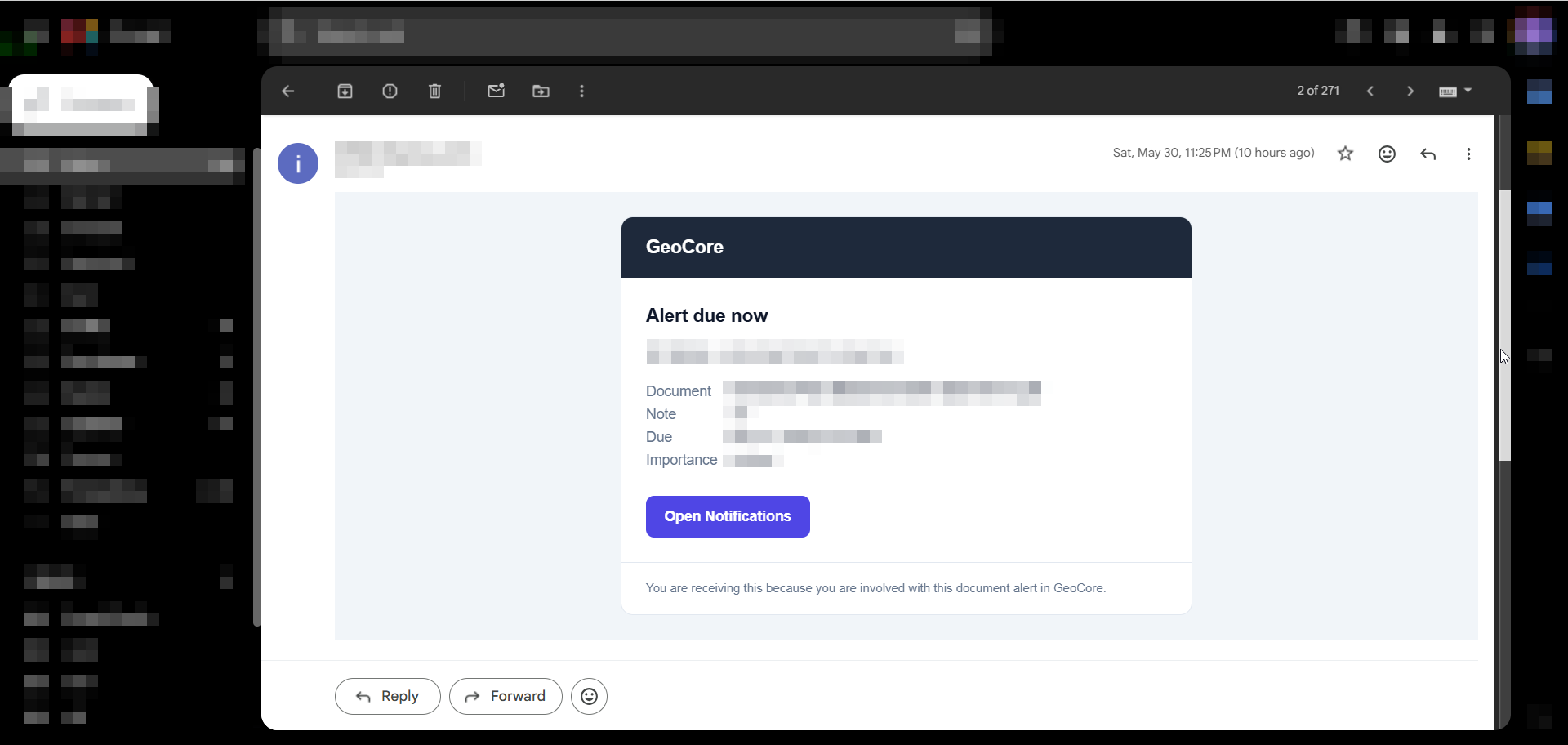
Each email lists the Document, Note, Due date, and Importance, plus an Open Notifications button that links straight to the dashboard. The system checks for due notifications every few minutes, so an email arrives shortly after its trigger time, not necessarily to the exact second. Each notification is sent once, so you will not get duplicates. Acknowledging or dismissing an alert stops further emails for it, and in particular prevents the overdue escalation email.
Key concepts (the fields on an alert)
| Field | What it means |
|---|---|
| Note | A short description of the reminder. Required. Up to 2000 characters. |
| Alert Date | The date/time the alert is due. Defaults to tomorrow at 9:00 AM. Required. |
| Reminder | How far ahead to send the reminder email (lead time). Options: No reminder, 1 day, 3 days, 1 week, 2 weeks, 1 month before. |
| Importance | Priority level: Standard, Important, Critical, Other. Controls color-coding in the dashboard. |
| Assigned Users | Project members responsible for the alert. They receive its notifications. Only members of the project can be assigned. |
| Status | Lifecycle of the alert: Pending, Triggered, Acknowledged, Dismissed. |
Importance levels
| Level | Color | Use it for |
|---|---|---|
| Critical | Red | Hard deadlines, legal/compliance, expiries |
| Important | Amber | Time-sensitive items that need attention |
| Standard | Grey | Routine reminders |
| Other | Blue | Anything that does not fit the above |
Status values
| Status | Meaning | Set by |
|---|---|---|
| Pending | Active and waiting; the default for a new alert. | System (on creation) |
| Triggered | The alert’s date has arrived; the “due” notification has gone out. | System (automatically when due) |
| Acknowledged | A user has seen it and confirmed it is handled. Stops escalation. | User |
| Dismissed | Closed without action or no longer relevant. Stops escalation. | User |
Who can do what (permissions)
| Action | Required access |
|---|---|
| Create an alert | Write permission on the document (and the document must belong to a project) |
| Edit or delete an alert | The alert creator, or a document admin |
| Acknowledge or dismiss an alert | Anyone with read access to the document |
| Be assigned to an alert | Must be a member of the project |
Step 1: Add an alert while uploading a document
You can attach an alert at the moment you upload a file.
- Start a document upload on the Documents page, uploading into a project (the alert option appears only for project uploads in per-file mode).
- In the upload panel, find the Alert / Notification section and switch the Add Alert toggle on.
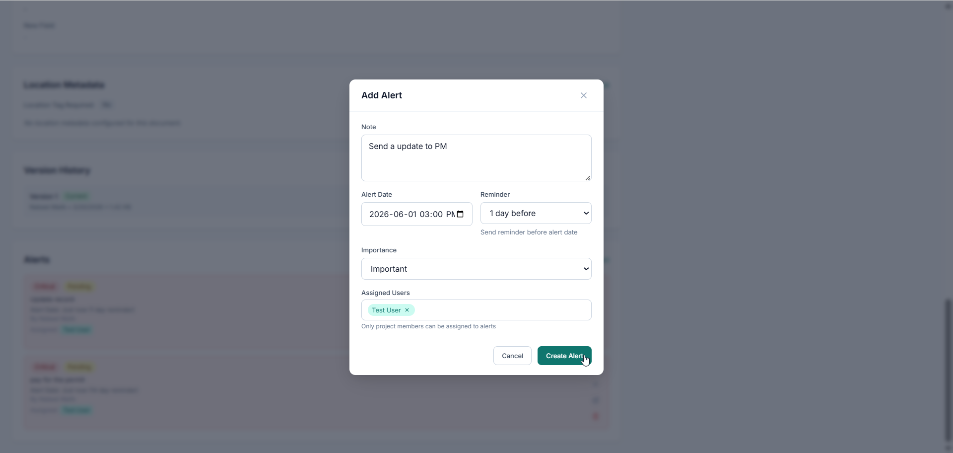
- Fill in the Note, Alert Date, Reminder, Importance, and optionally Assigned Users.
- Complete the upload. The alert is saved with the new document and its notifications are scheduled automatically.
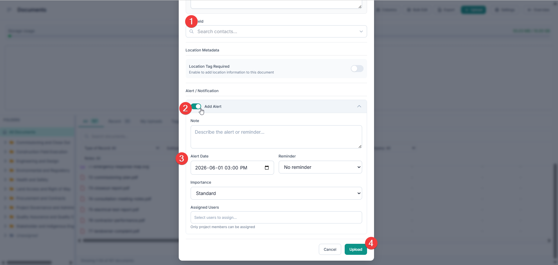
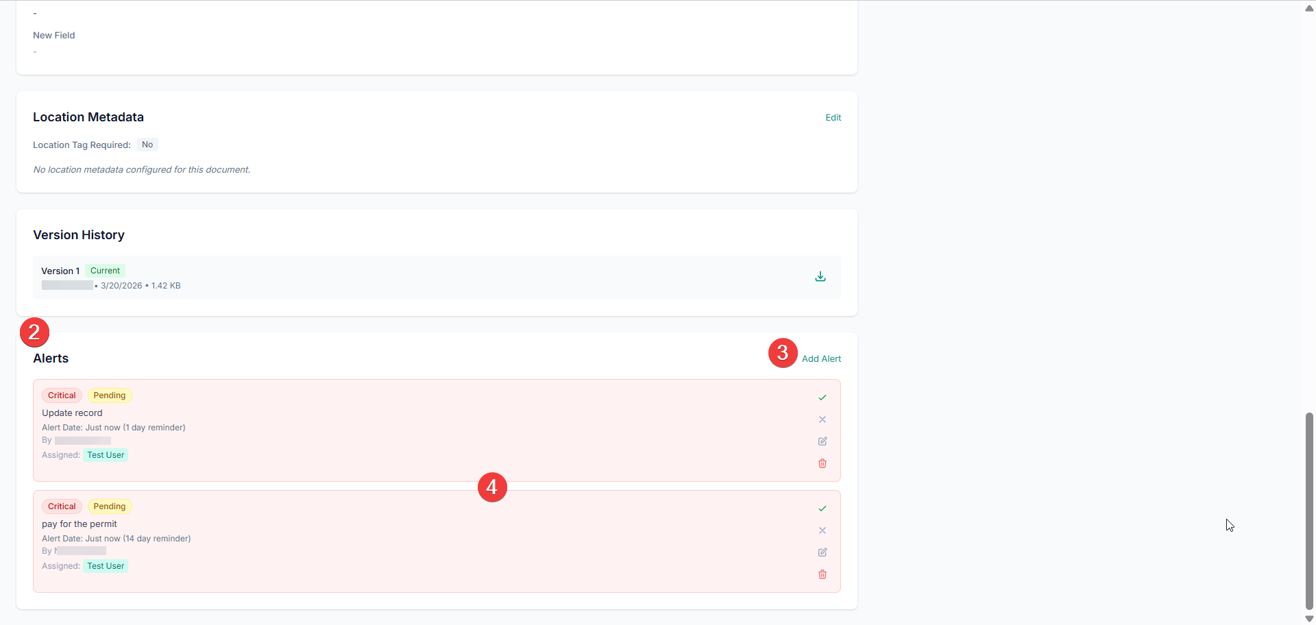
Step 2: Add or manage alerts on an existing document
- Open a document to its detail page.
- Scroll to the Alerts section.
- Click Add Alert to open the alert form, fill it in, and click Create Alert.
- Existing alerts are listed here. From each one you can Acknowledge, Dismiss, Edit, or Delete (subject to permissions).
Step 3: Open the Notifications dashboard
- Go to the project’s Documents page.
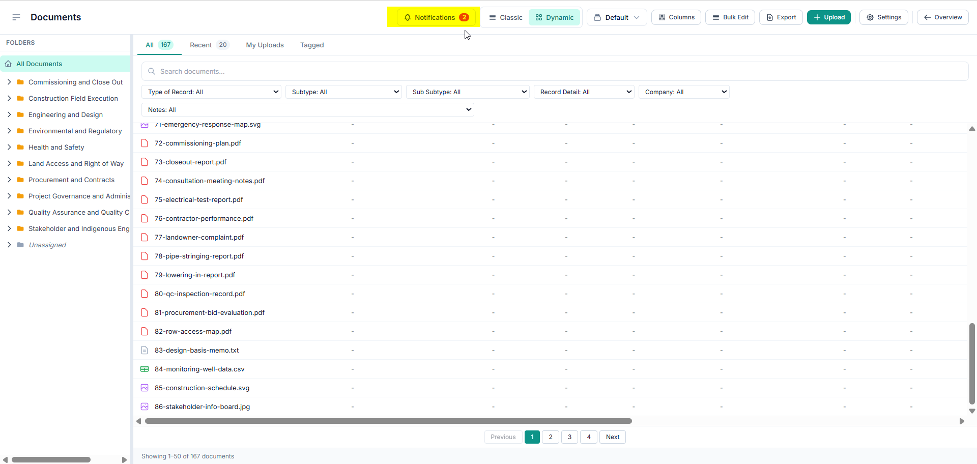
- Click the Notifications button (bell icon) in the toolbar.
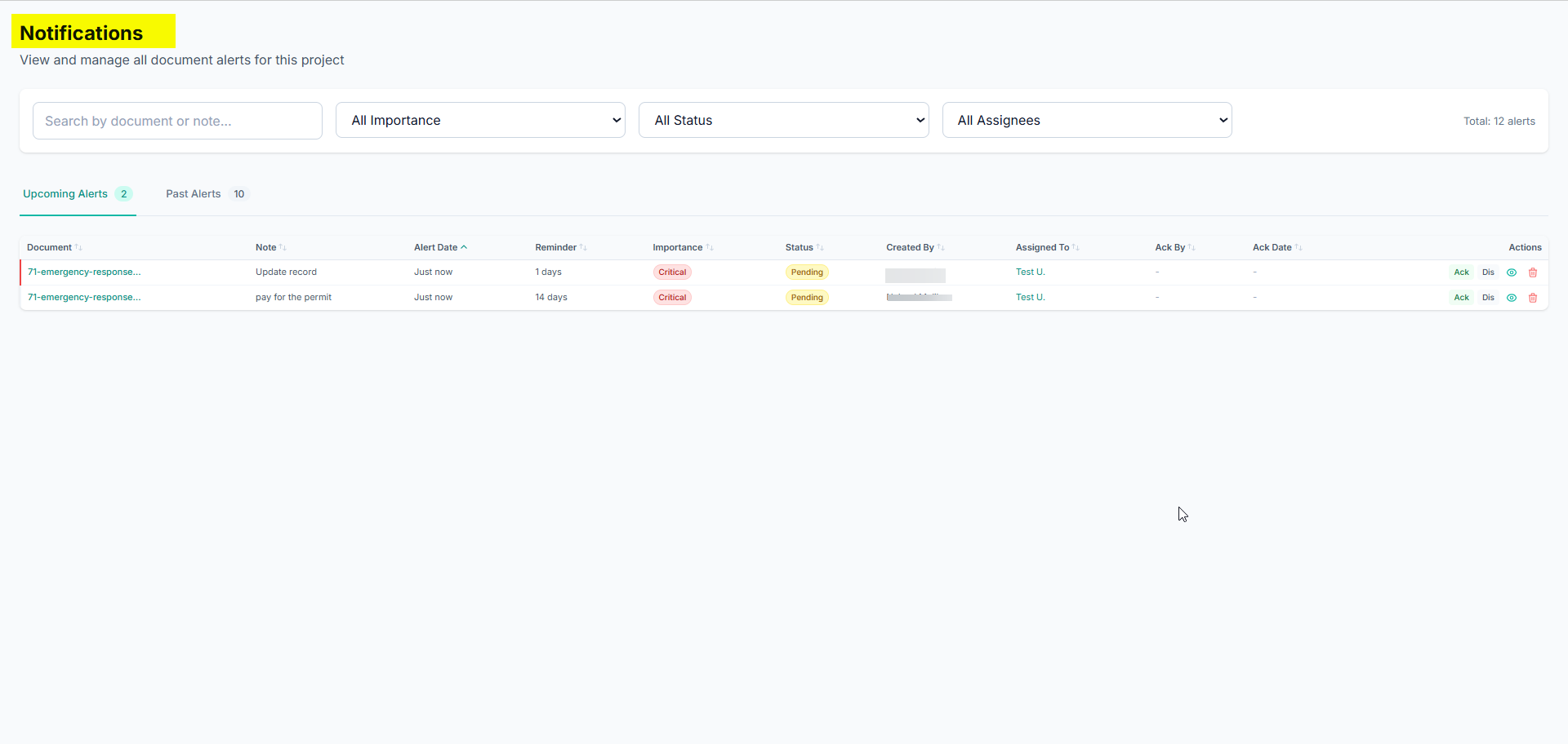
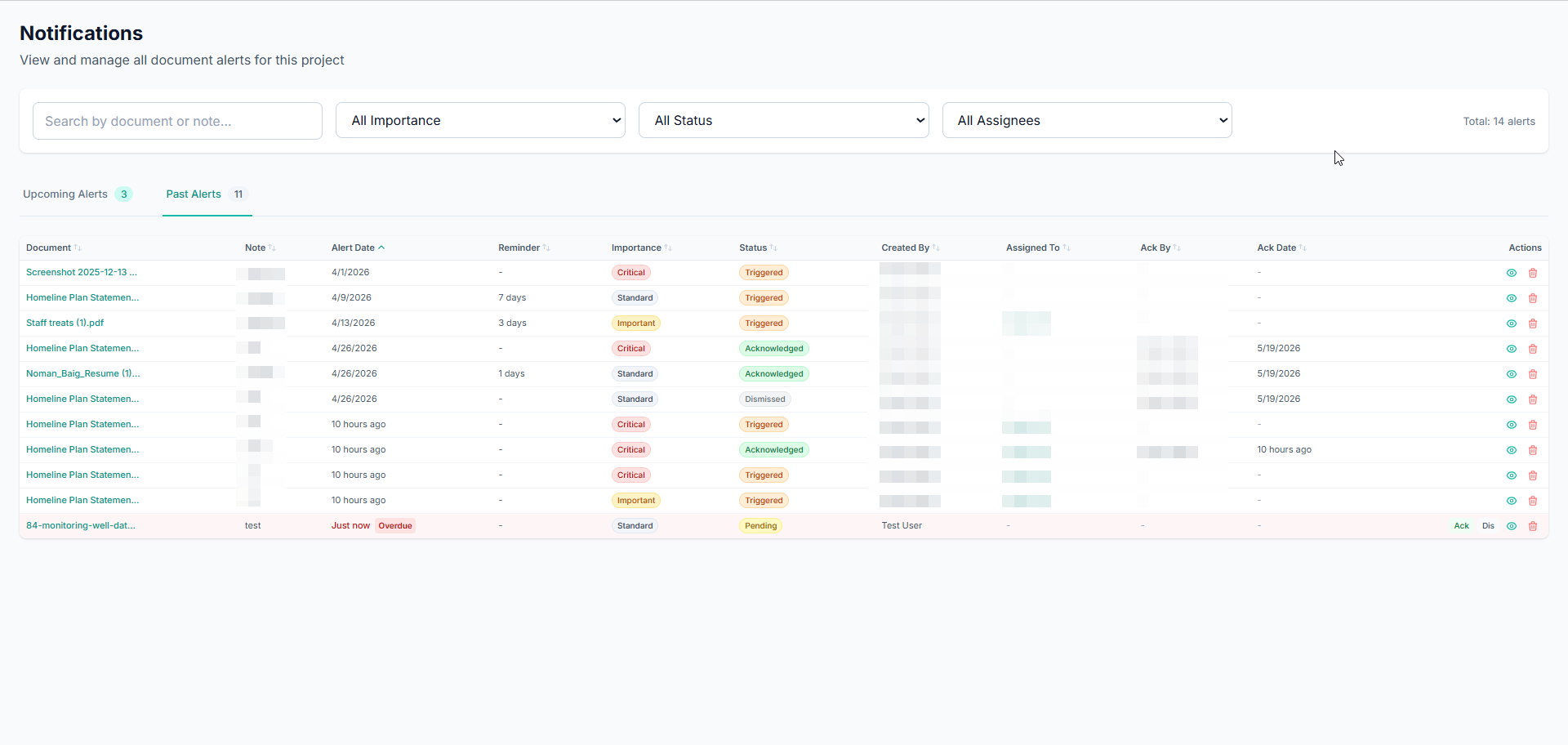
- This opens the Notifications page: the central list of every alert in the project.
Step 4: Find the alerts you care about
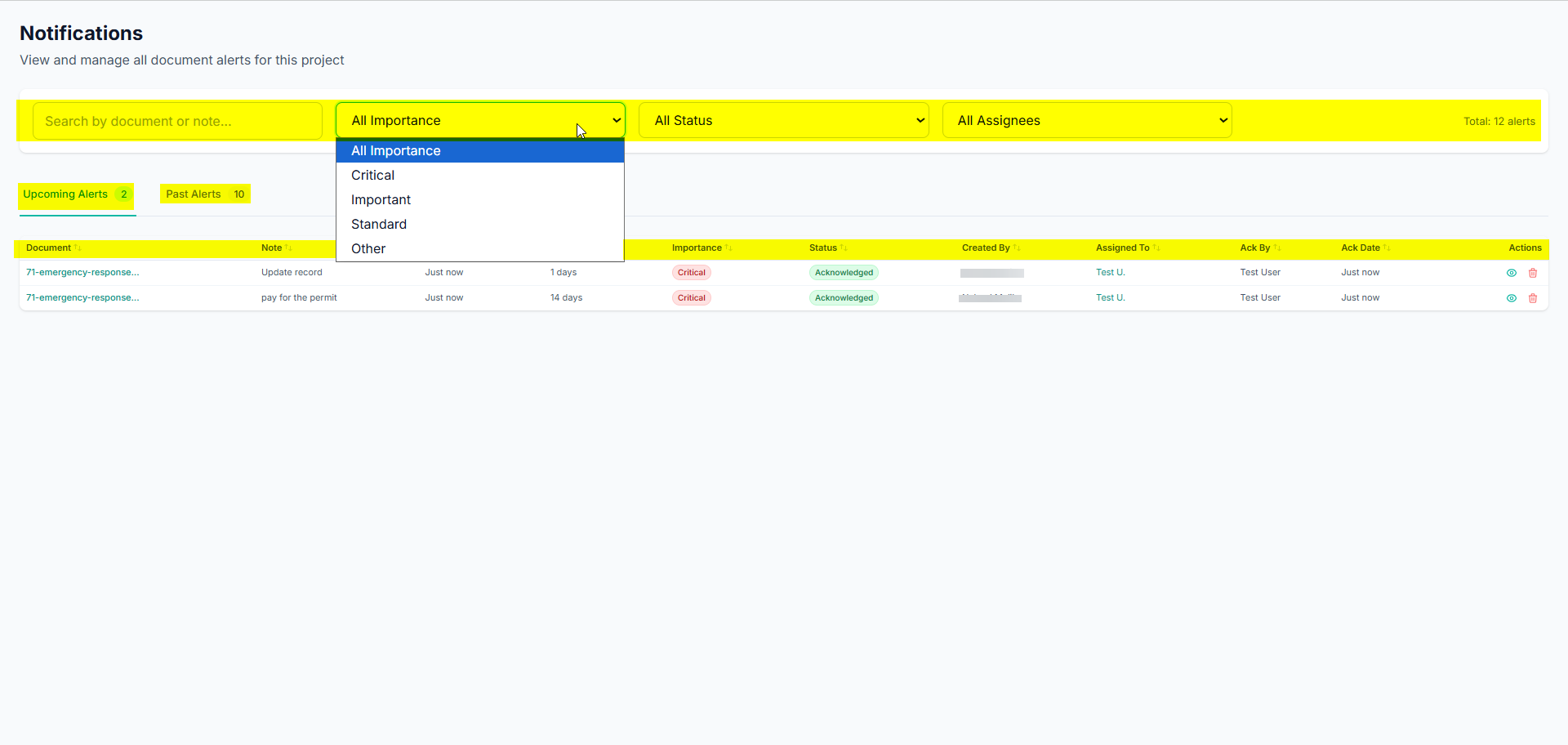
The Notifications page gives you several ways to narrow the list:
- Upcoming Alerts / Past Alerts tabs: split by whether the alert date is in the future or the past. Each tab shows a count.
- Search: match by document name or note text.
- Importance filter: Critical, Important, Standard, Other.
- Status filter: Pending, Triggered, Acknowledged, Dismissed.
- Assignee filter: show only alerts assigned to a specific member.
- Sort: click any column header (Document, Note, Alert Date, Reminder, Importance, Status, Created By, Assigned To, Ack By, Ack Date) to sort; click again to reverse.
Pending Critical alerts show a red left border and Important ones an amber border, so urgent items stand out.
Step 5: Act on an alert
From the dashboard (or the document’s Alerts section), each open alert offers quick actions:
- Ack (Acknowledge): mark that you have seen and handled it. Records your name and the date/time under Ack By / Ack Date, and stops any further escalation emails.
- Dis (Dismiss): close it as no longer relevant. Also recorded, and also stops escalation.
- View Document (eye icon): jump straight to the related document.
- Delete (trash icon): permanently remove the alert (creator or document admin only; asks for confirmation).
Once an alert is due, you have roughly a day to acknowledge or dismiss it before an escalation email goes to the project admins.
What a notification email looks like
Every alert email uses the same clean layout: a GeoCore header, the alert details (Document, Note, Due, Importance), and a blue Open Notifications button that takes you to the dashboard for that project. The escalation email is styled with a red “past due and not acknowledged” warning; the digest lists all of your open alerts with overdue ones marked.
Tips & best practices
- Write action-oriented notes. “Renew environmental permit, submit form 3 weeks prior” beats “permit”.
- Always set a Reminder lead time for anything with prep work, so the reminder email lands with enough runway.
- Assign the right owners. Assigned users (and the creator) receive the emails; assign whoever actually needs to act.
- Use Critical sparingly so it stays meaningful for true deadlines.
- Acknowledge or dismiss promptly. This keeps the Upcoming tab focused and prevents unnecessary escalation emails to admins.
- Check the daily digest. Each morning’s summary is the quickest way to see everything still open and anything overdue.
The exact send cadence, escalation delay, and email provider are configured by your administrator.
Working with Virtual Folders
Virtual folders let you browse documents organized automatically by their metadata, for example by Type of Record → Status → Year, instead of by the physical folders they were uploaded into. Nothing is moved or copied; it’s just a different view of the same documents. Change a document’s metadata and it instantly appears in the right virtual folder.
You can view the same documents two ways: Classic (the traditional folder view with all files in a single list, filterable by dropdowns) or Dynamic (metadata-driven virtual folders).
Only company admins can enable virtual folders and create configurations. Anyone on the team can browse them once they’re enabled.
Before you start
Virtual folders are built from metadata fields, so the project needs an active Metadata Schema first. If it doesn’t have one, the settings page shows a yellow “No Metadata Schema” warning with a link to set one up.
Step 1: Open Virtual Folder Settings
- Go to the project’s Documents page.
- Click the Settings button (gear icon) in the top-right toolbar.
- Choose Virtual Folders from the dropdown.
Step 2: Enable Virtual Folders
Switch the Enable Virtual Folders toggle on. More options appear once it’s enabled.
Step 3: Choose the Default View
Under Default View, pick what users see first when they open Documents:
- Traditional (Folders): opens in Classic view.
- Dynamic (Virtual Folders): opens in virtual view.
Each user’s last-used choice is remembered on their device, so this is just the starting point.
Step 4: Create a Folder Configuration
A configuration defines the folder hierarchy, which metadata fields become folder levels and in what order.
- In Saved Configurations, click + New Configuration.
- Enter a Configuration Name (e.g. “By Record Type & Date”).
- Under Folder Hierarchy, use + Add field to hierarchy to add metadata fields one at a time. Only groupable field types appear: dropdown, multi-select, text, number, and date.
- Drag the rows (using the handle on the left) to set the order. The labels
L1,L2,L3show the folder nesting;L1is the top level. - Optionally, type a Custom label for any level to rename it in the breadcrumb.
- Click Create Configuration.
When you add a date field, a grouping selector appears with three choices: Full Date (one folder per exact date), Year / Month (two levels), or Year / Month / Day (three levels). A single date field can generate several folder levels automatically.
Step 5: Set the Active Configuration & Save
- Each configuration is listed with its level count and last-modified date. Click the radio button next to one to make it the Active configuration, which is what everyone browses.
- Click Save Settings to store the enable toggle and default view. Creating, editing, deleting, and activating configurations save immediately on their own.
The pencil icon reopens a configuration for editing; the trash icon deletes it (a second click confirms). You can’t delete the only remaining configuration.
Step 6: Browse in Dynamic View
Back on the Documents page, once virtual folders are enabled and the active configuration has at least one level, a Classic / Dynamic toggle appears in the toolbar.
- Click Dynamic.
- The left panel becomes a virtual folder tree, and the main area shows folders with their document counts.
- Click into folders to drill down. The breadcrumb (starting with All) shows your path; click any segment to jump back.
- Documents missing a value for a level are grouped under an Unassigned folder.
Step 7: Switch Between Configurations While Browsing
If a project has two or more saved configurations, a configuration selector dropdown appears in the toolbar (Dynamic view only). Use it to instantly re-organize the same documents a different way, for example, switch from “By Department” to “By Date.”
Good to know
- Multi-select fields: a document with several values appears in each matching folder.
- Sorting: years newest-first, months in calendar order, days ascending, everything else alphabetical. Unassigned always sorts last.
- Live updates: changing a document’s metadata moves it between virtual folders automatically, with no re-filing needed.